65 Forward — a senior-first digital front door.
Reimagining the digital front door to a senior-focused primary care experience — across web, social, email, and print.
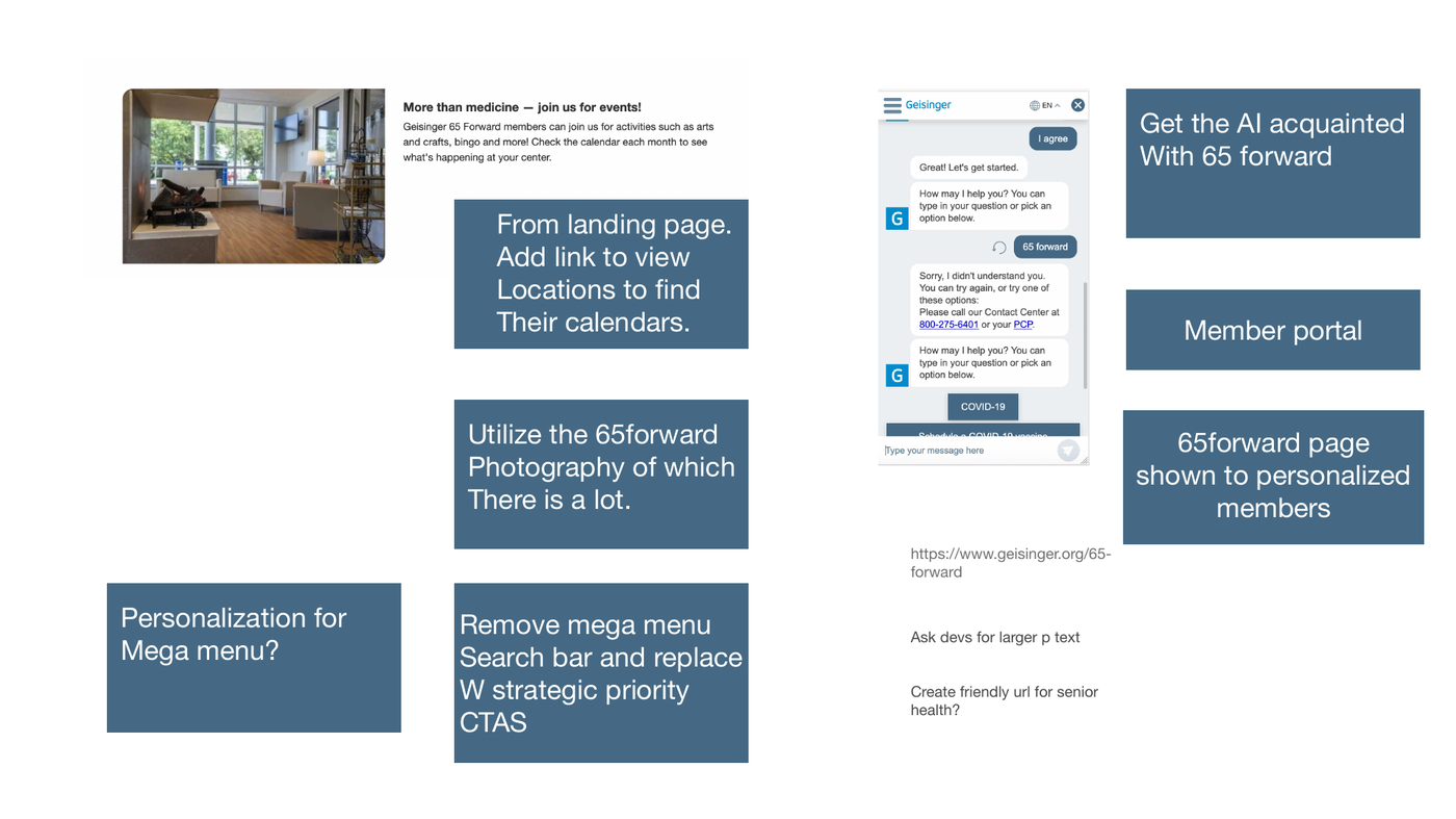
A page built to convert — not just describe.
At a glance.
Geisinger 65 Forward is a senior-focused primary care offering, exclusive to Geisinger Gold Medicare Advantage members. The original landing page introduced the program faithfully, but didn't help the right people find it, sign up for tours, or convert into enrolled members.
I led an end-to-end redesign covering the core landing page, location-specific variants, the member ebook, and supporting wellness, social, and email touchpoints — turning a brochure page into a marketing engine.
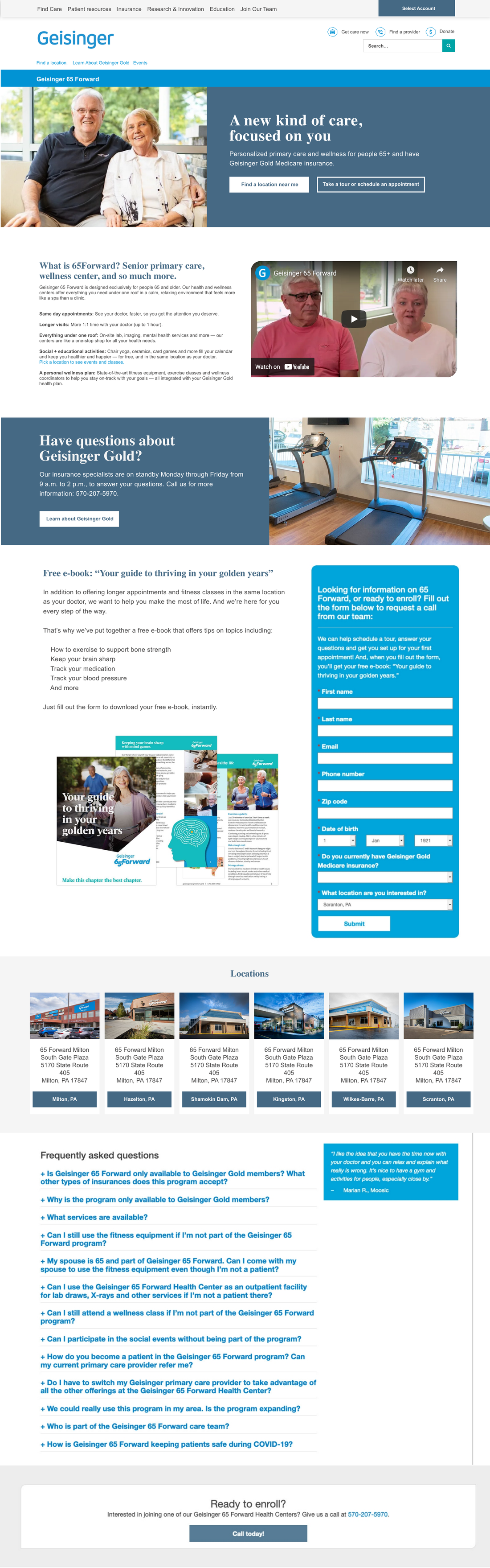
A landing page that wasn't landing.
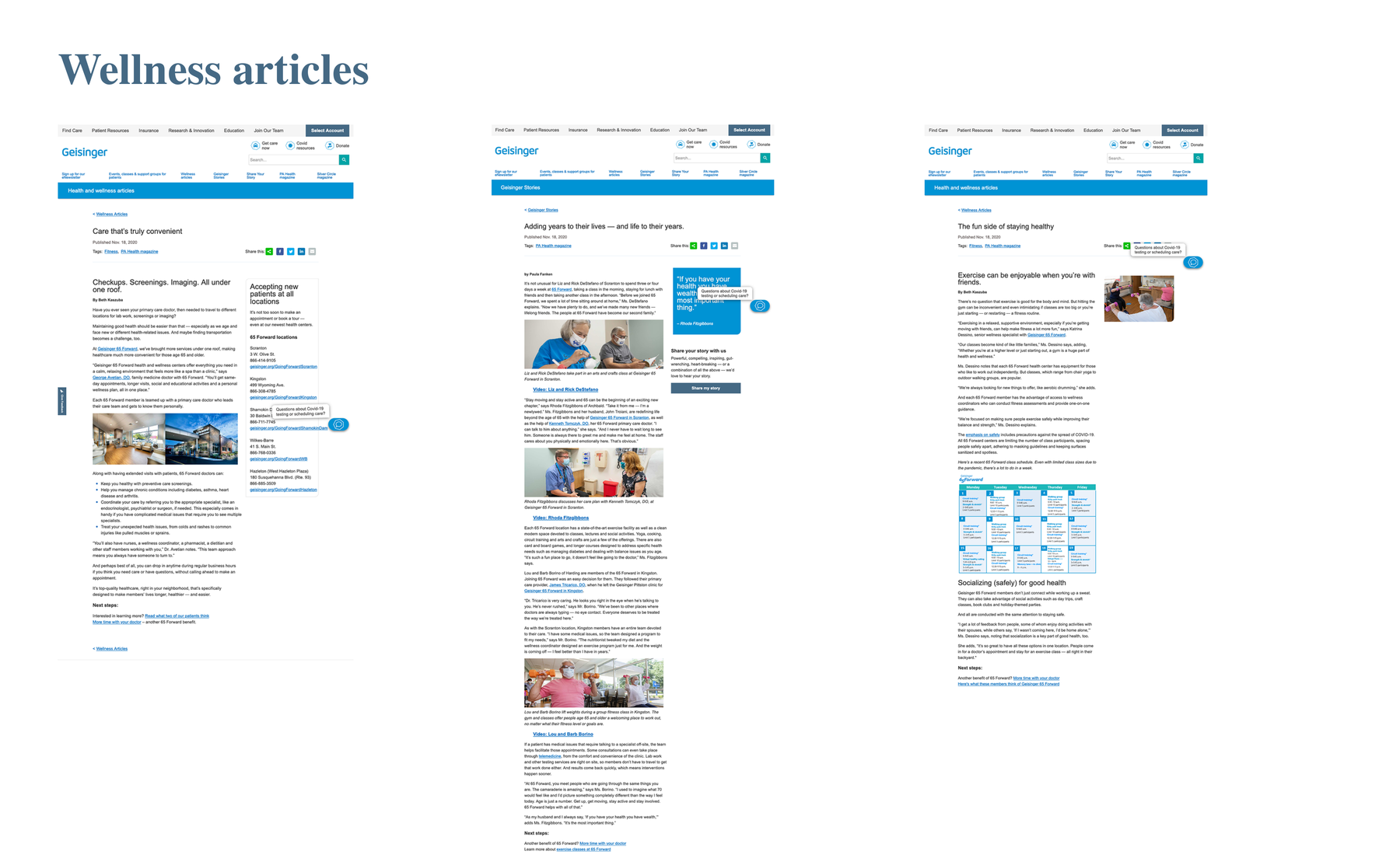
The legacy 65 Forward page packed every detail of the program into dense paragraphs sitting under a quiet, generic header. A roof full of services — personal wellness plans, longer visits, free events — buried in text.
The program's biggest asset — the spa-like atmosphere of the centers themselves — was nowhere visible above the fold. Prospects were being asked to read their way to a tour.
SEO was untargeted, the value proposition came late, and the page worked as a brochure for people already convinced. For everyone else, it didn't land.
Listening before redesigning.
Three parallel investigations to understand who was arriving on this page, what they needed, and where the experience was leaking.
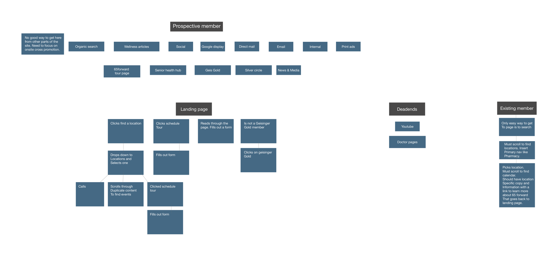
Stakeholder interviews
Spoke with program coordinators and marketing leads at three 65 Forward locations to understand enrollment goals and friction points.
Analytics audit
Mapped drop-off points in Google Analytics. Bounce rates on the landing page exceeded 72%. Most users never scrolled past the fold.
Competitor review
Audited five comparable senior wellness programs — CenterWell, ChenMed, Oak Street and others. Most shared the same failure mode: long feature lists, stock photography, no clear CTA hierarchy.
Three problems worth solving.
The patterns from discovery converged on three issues — each one specific enough to design against.
Wrong audience reaching the page
SEO was untargeted. The page surfaced for broad Medicare queries rather than intent-heavy searches like "senior primary care near me." Visitors were arriving confused.
No visual proof of the experience
The centers are beautiful — warm, spa-adjacent, purpose-built for older adults. None of that came through in the original page. Text-only content couldn't build trust.
One CTA, buried below the fold
The primary action — scheduling a tour — appeared once, at the bottom of a long scroll. There was no persistent, contextual nudge at the moments of peak intent.
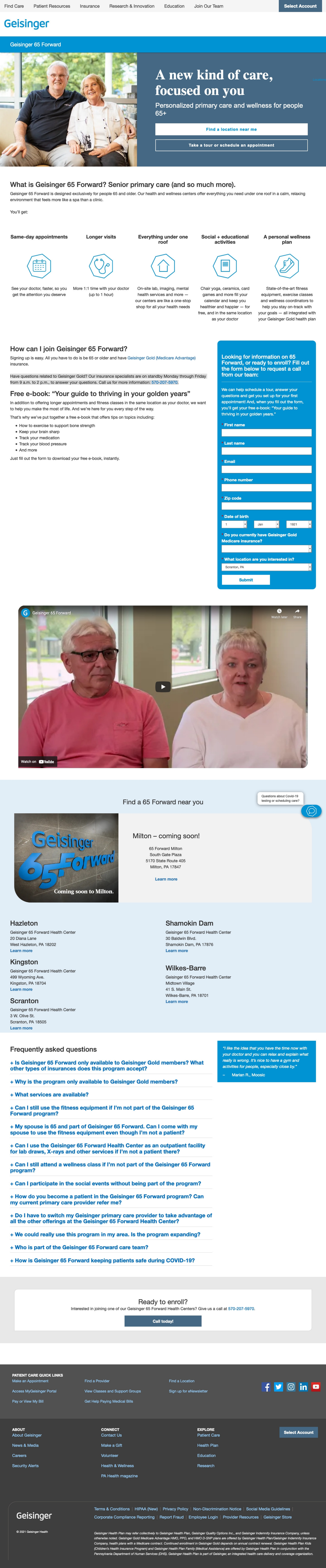
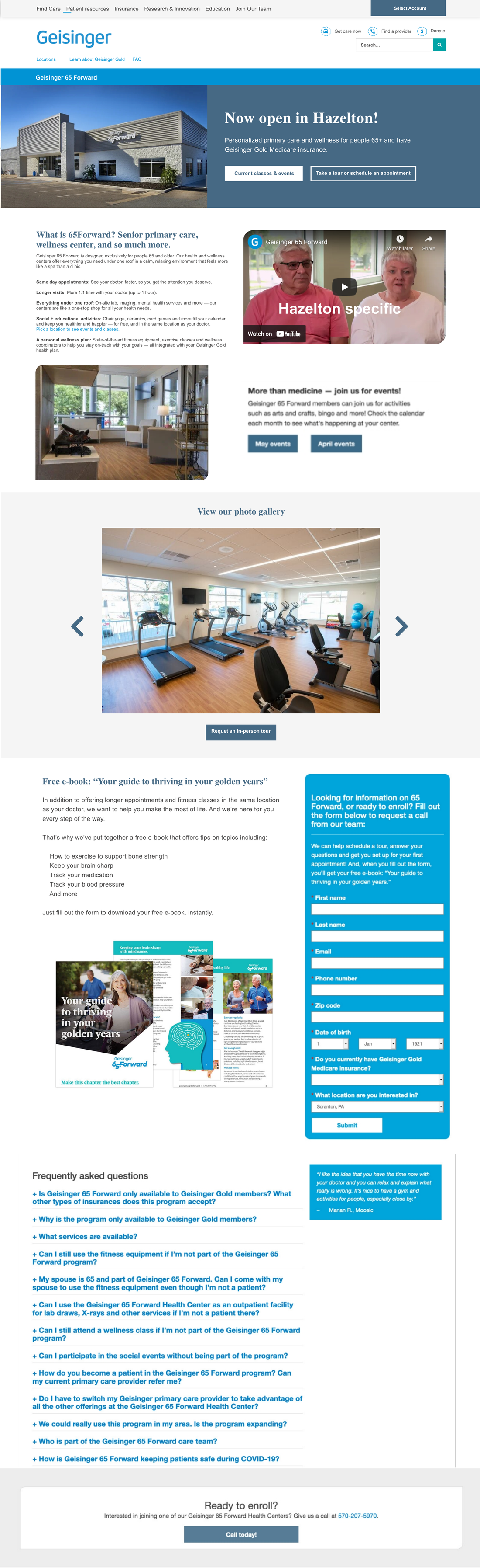
From brochure to conversion engine.
The redesign answered each finding with a specific design move — photography-led hero, location-specific variants, multi-channel funnel.
Shipped, measured, iterated.
Outcomes three months after the redesign launch.
Reflection
Working as the sole designer across a project this wide — from UX strategy to ebook layout to Instagram grids — required constant prioritization. The constraints were real: stakeholders with competing goals, accessibility requirements for a 65+ audience, and a brand system that predated modern design tooling. The discipline was learning which battles moved the needle on enrollment, and letting the rest be good enough.