Making the Geisinger.org navigation accessible.
Led the redesign of Geisinger.org's primary navigation so it works for keyboard and screen-reader users, meeting WCAG 2.1 AA without changing the look and feel patients already knew.
- Make the primary navigation fully keyboard operable
- Meet WCAG 2.1 AA for the nav experience
The problem
Geisinger.org's navigation is the front door to care for a large, aging patient population, many of whom rely on assistive technology. The original menu looked fine, but it quietly excluded the people who most needed to get through it.
What was breaking down
- The mega-menu could not be fully opened or operated with a keyboard alone, so keyboard-only users couldn't reach large parts of the site.
- There was no visible focus state, so anyone tabbing through the menu lost track of where they were.
- Screen readers did not announce submenus or whether they were open or closed, leaving non-visual users guessing.
- Several labels and hover states fell below the WCAG AA contrast threshold.
Why it mattered
For a health system the navigation is not decoration. It is how people find a provider, refill a prescription, or reach urgent care. Excluding assistive-technology users is not just an accessibility gap, it is a care-access gap, and a compliance risk under the ADA and Section 508.
How I audited it
I paired hands-on technical testing with live sessions involving real users, so the fixes were grounded in lived experience rather than a checklist alone.
Testing methods
- Live user interviews with participants across diverse demographics, ages, and abilities, including people who navigate primarily by keyboard and by screen reader.
- Keyboard-only walkthroughs of every menu path: Tab, Shift+Tab, Enter, Space, Esc, and arrow keys.
- Screen-reader testing with VoiceOver and NVDA to hear exactly what was and was not announced.
- Automated and manual color-contrast checks against WCAG AA.
What I measured against
I mapped every issue to specific WCAG 2.1 AA success criteria, chiefly 2.1.1 Keyboard, 2.4.7 Focus Visible, 4.1.2 Name, Role, Value, and 1.4.3 Contrast, so "accessible" meant something concrete and testable rather than a vague goal.
What I changed
I rebuilt the navigation as an accessible pattern from the markup up, keeping the existing visual design so the change was invisible to sighted mouse users and transformative for everyone else.
Information architecture, driven by research
Working from the user research, I reorganized the navigation's information architecture: regrouping and relabeling menu items so people could actually find the pages nested inside them. Getting the structure right meant fewer users lost in submenus, before a single accessibility attribute was added.
Keyboard support
Made every menu item reachable and operable by keyboard: a logical Tab order, Enter or Space to open a section, Esc to close it, and arrow keys to move between items.
Focus visibility
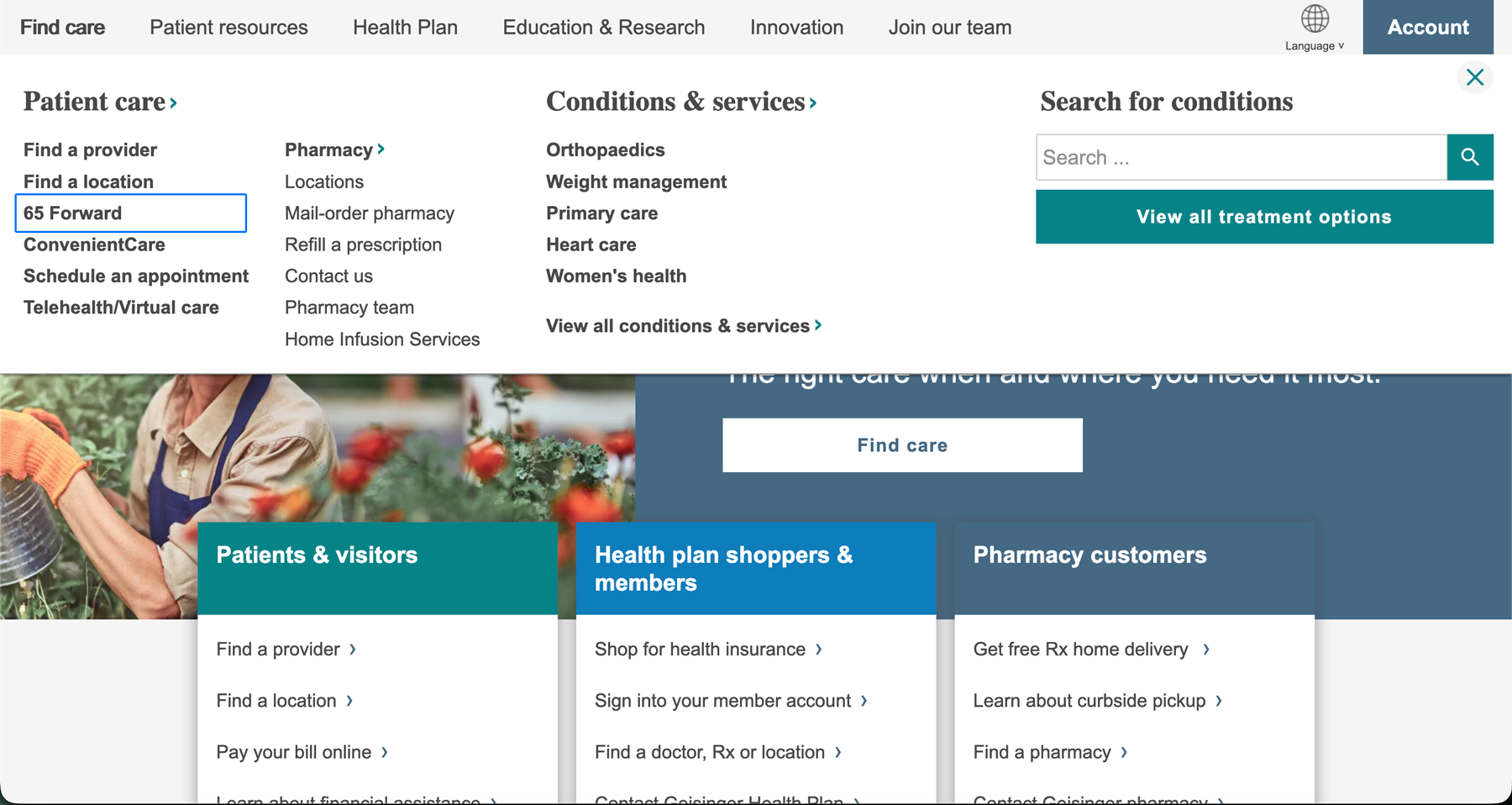
Added a clear, high-contrast focus ring so keyboard users can always see exactly where they are. It is the single most visible change, shown in the after screenshot below.
Screen-reader semantics
Applied correct roles and state with aria-expanded and aria-current, so screen readers announce each submenu and whether it is open, closed, or the current page.
Contrast and targets
Raised label and hover-state contrast to meet WCAG AA and made sure every target was large enough to tap or click comfortably.
Before and after
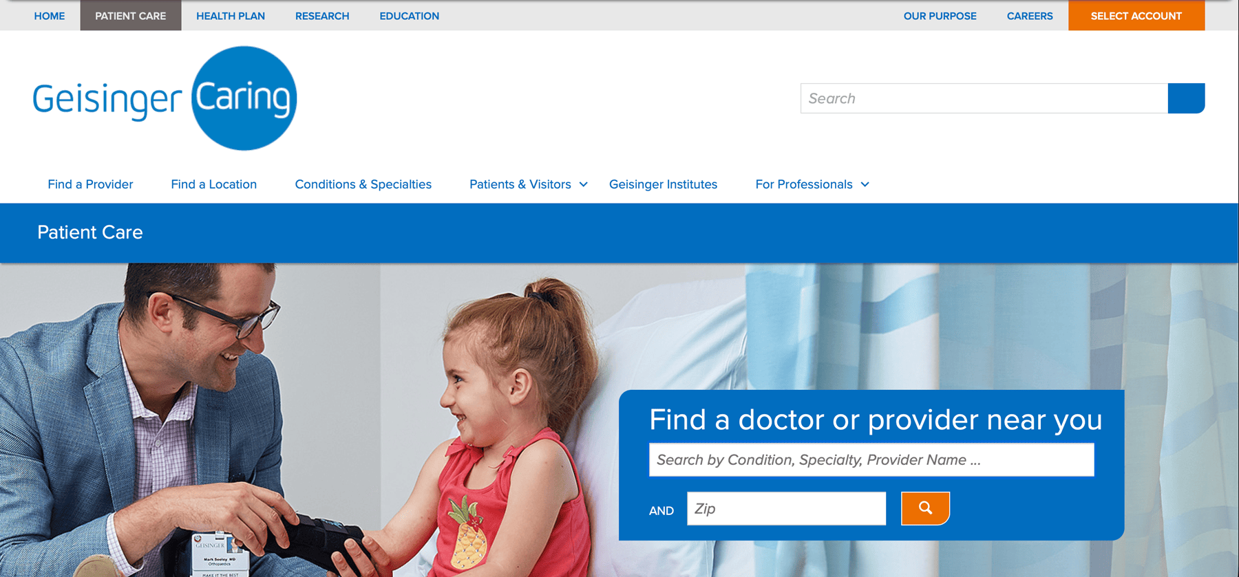
Same brand, same layout, a fundamentally different experience for anyone using a keyboard or screen reader.
Impact
The redesign made the site's most important wayfinding usable for everyone, and helped move Geisinger.org's overall accessibility score to best-in-class.
Reflection
This project reset how I approach every design. Accessibility is not a final QA pass, it is a starting constraint that makes the work better for everyone. The keyboard and screen-reader patterns I established here became the baseline for the Geisinger.org redesigns that followed.