How UX design shaped the new Medicare Advantage experience.
An end-to-end redesign of Geisinger.org's Medicare Advantage section — research, competitive analysis, IA, and a new "Learn" microsite built to convert shoppers, not just inform them.
- Increase online enrollments
- Create a best-in-class Medicare Advantage web experience
What UX brought to the project
Before the redesign, the section was a brochure. UX brought the discipline to turn it into a conversion surface — and to keep humans in the loop at every step.
Discovery & planning
- Research — analytics, competitor scans, stakeholder interviews
- Strategy — defining shopper journeys and the gaps to fill
- Testing — validating decisions against real shopper goals
Design & execution
- Design systems — reusable layouts and components
- Digital branding — visual cohesion with Geisinger.org
- User interfaces — page-by-page UI for shoppers
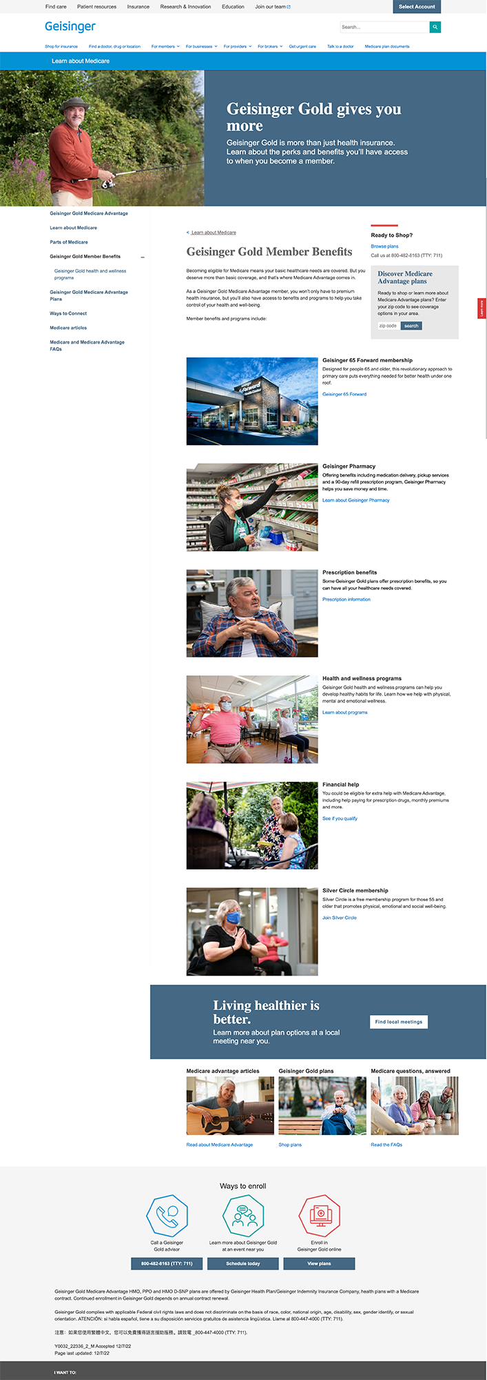
Current state analysis
Started by auditing the existing Geisinger Gold pages — annotating layout failures, content gaps, and conversion friction page-by-page.
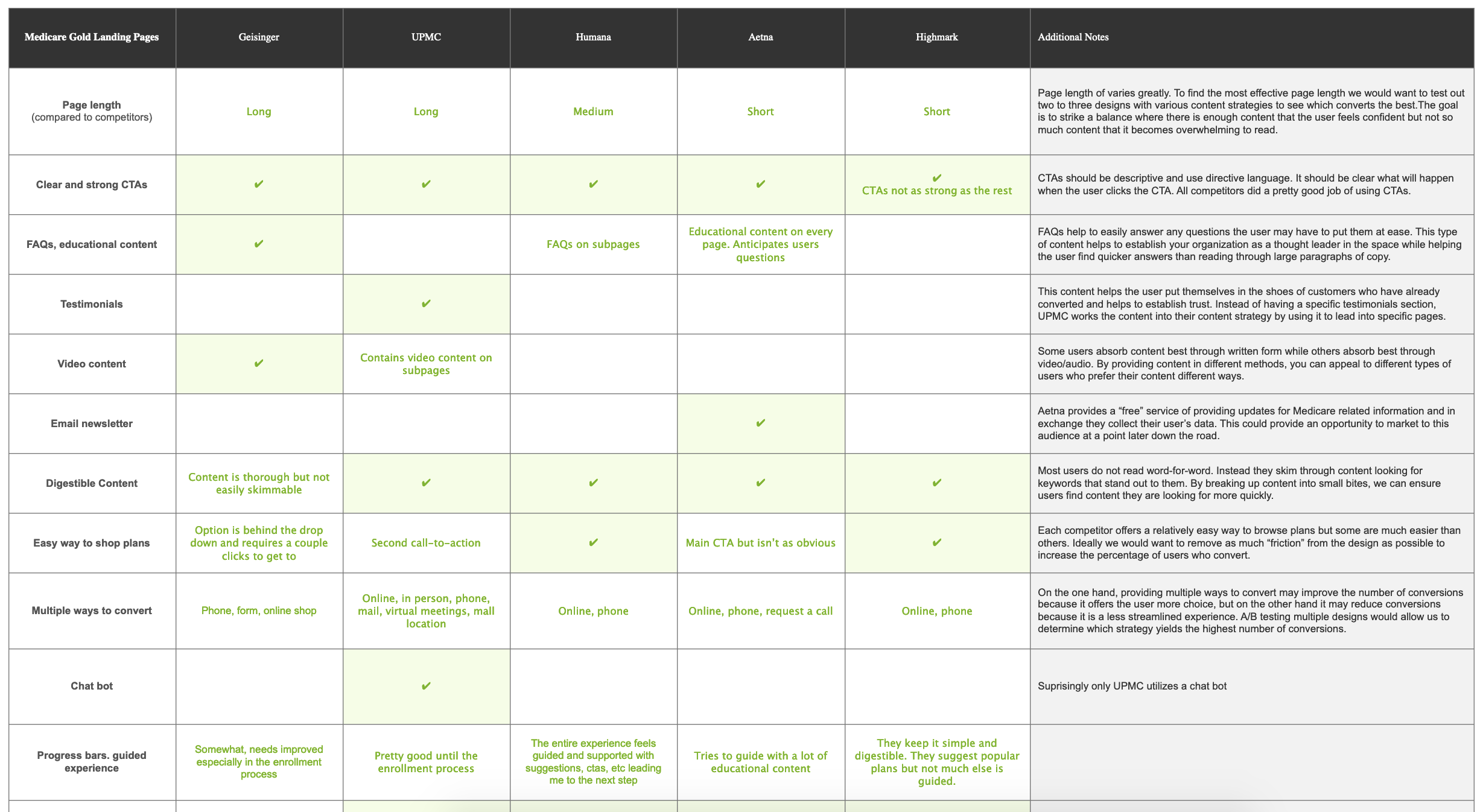
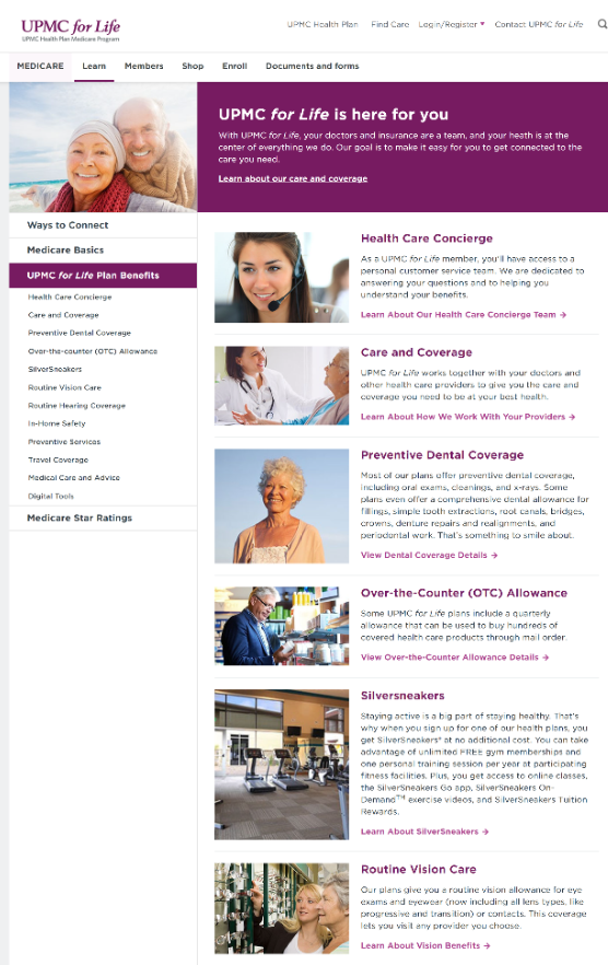
Competitor analysis
Audited UPMC, Highmark, Aetna, and Humana for the same shopper tasks Geisinger pages were failing on. The patterns became the brief.
Side-by-side comparison across five competitors below.
Key insight: the educational gap
Geisinger wasn't teaching shoppers anything.
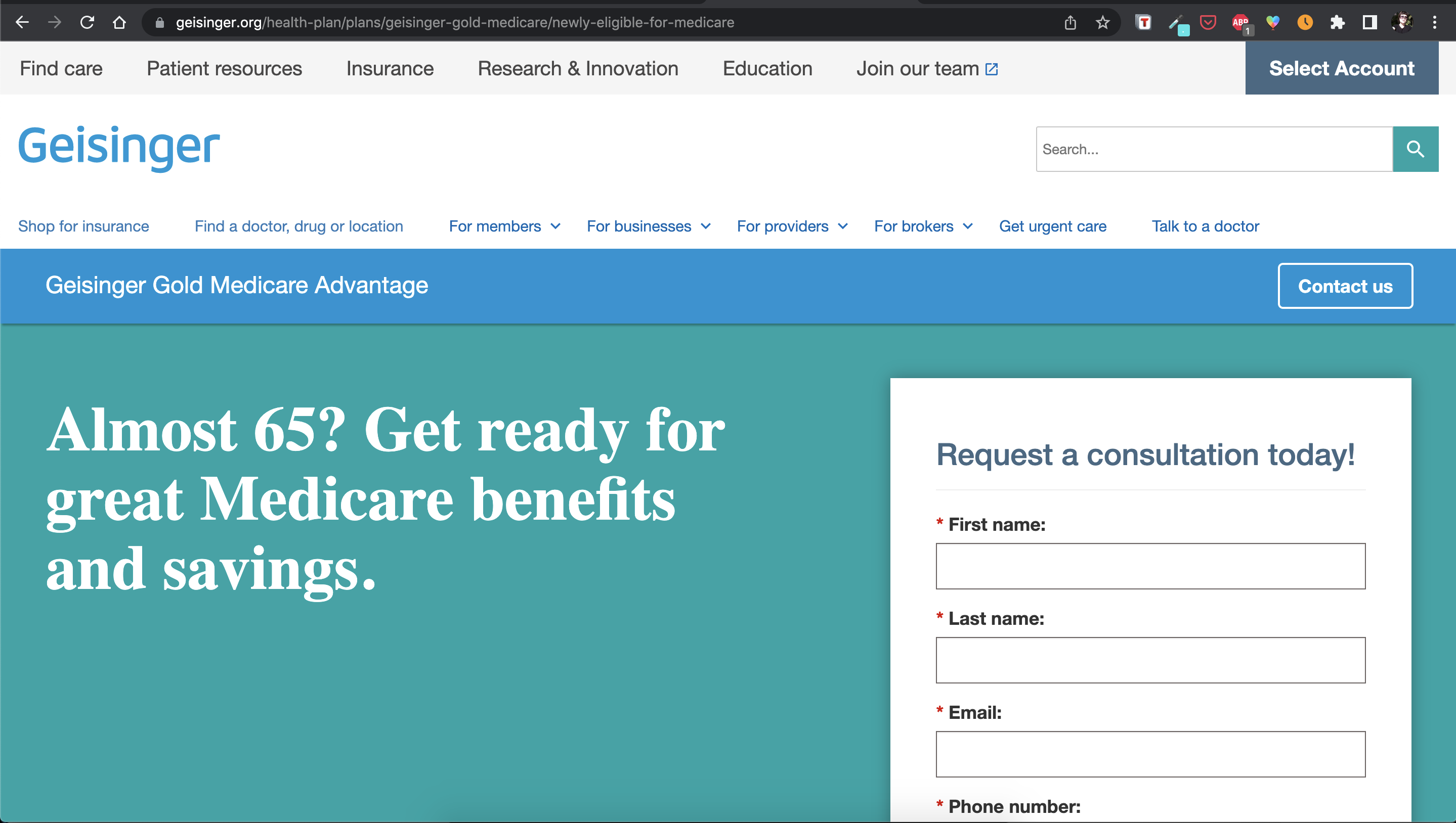
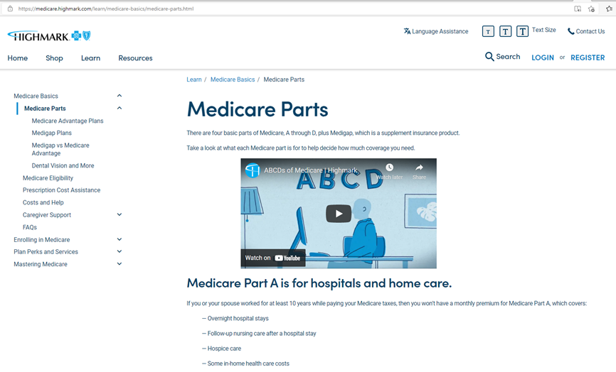
Compared to competitors, Geisinger did not offer sufficient educational content to help shoppers learn about our products before taking action. Aetna, UPMC, and Highmark all had robust learn-then-buy experiences. Geisinger pushed shoppers straight to a form.
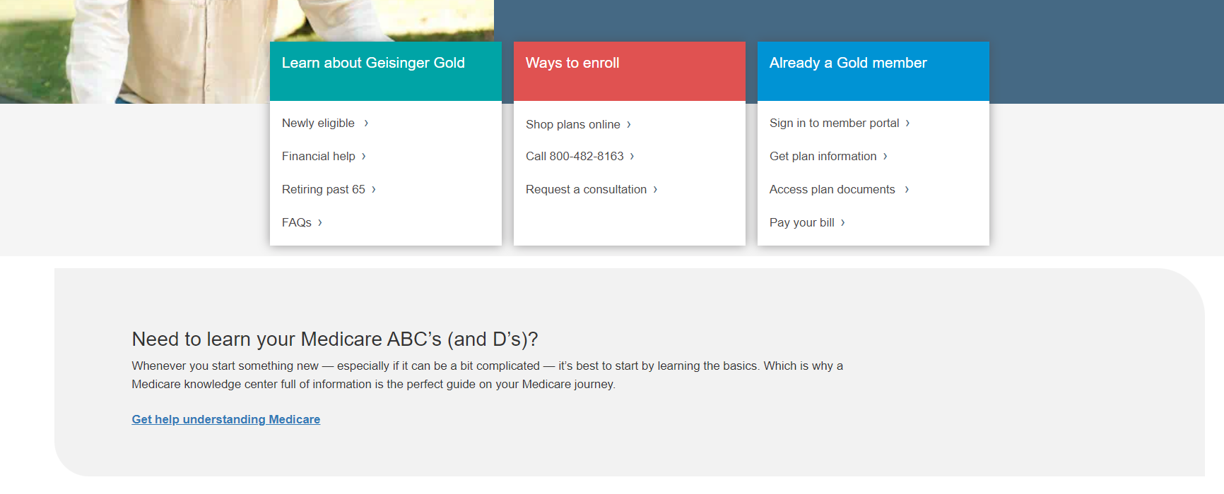
Designed and built a robust "Learn" microsite.
A new microsite for shoppers, with SEO-optimized content that guides and empowers shoppers to learn about Medicare, then buy the Geisinger plan that best meets their needs.
Example: shopper-education content, before
The new Medicare "Learn" section
A SEO-optimized microsite that meets shoppers at the start of their journey — eligibility, plan types, costs, perks — before pushing them into the funnel.
What it does
Educates shoppers at the start of the funnel with structured content covering the four parts of Medicare, eligibility timing, plan comparisons, and benefit breakdowns — written and structured for the actual questions shoppers were searching for.
The microsite hands shoppers off to the enrollment surface only when they're ready, instead of demanding an action at first contact.
Why it worked
- Content matched the questions shoppers were actually Googling
- One stop for eligibility, costs, plan types, and benefits
- SEO-optimized so the right shoppers land in the first place
- Hands shoppers into the enrollment funnel with intent, not pressure
User journeys, informed by user goals
Built shopper personas around the real goals shoppers brought to Geisinger.org — then mapped the journey each persona actually took (and where it broke).
User goals (in shopper voice)
- I want to learn about Medicare so I understand what plan is best for me.
- I want to understand how much plans cost so I know potential estimates for encounters and services (deductible, MOOP, Rx's).
- I want to understand what benefits are covered (medical + drug).
- I want to make sure my provider is in-network.
- I want to know about extras and perks available with my plan.
"New to Medicare" — Dan's journey
"AEP shopper" — Susan's journey
Article structure: the Balance template
Educational articles lacked structure.
The existing page with Medicare educational articles had no consistent layout or content hierarchy — making the content hard to scan, hard to navigate, and hard to extend.
Leveraged the "Balance" layout template.
Packaged Medicare education content into Geisinger's existing Balance template — a structured, scannable article layout already used elsewhere on the site. Familiar pattern, less invention required, better consistency.
At-a-glance perks
No at-a-glance tool for shoppers.
Shoppers had no quick way to see what Geisinger Gold actually covered. Aetna and UPMC both featured at-a-glance perks rows — Geisinger didn't.
Added a SEO-optimized at-a-glance perks section.
Worked with Medicare sales SMEs to identify the at-a-glance features worth promoting. Designed the section to mirror what shoppers already recognized from competitors — making Geisinger Gold legible at a glance.
Reflection
This was the project that taught me to design Geisinger.org pages as conversion surfaces, not brochures. The biggest unlock wasn't a single layout — it was the realization that shoppers were arriving without context, and that the page's first job was to teach before it asked for anything.
Patterns that emerged here — persona-led journey mapping, observation/what-we-did framing, leveraging existing templates instead of inventing — became the working method for every Geisinger.org redesign that followed.