.Org 2024 Design Enhancements
A year-long visual and UX refresh across Geisinger.org — modernizing 20+ pages, adding 50+ custom icons, and shipping new components strategists could put to work.
At a glance
Core enhancements
The human brain processes roughly 36,000 visual messages per hour, compared to about 15,000 words. The 2024 refresh leaned into that — swapping wall-of-text patterns for visual hierarchy, custom iconography, and content that scans before it reads.
Upgraded visual interest
- Introduced custom designed infographics and vector graphics
- Added more color through highlight lines on components
- Added 50+ icons, including original custom artwork
Better UX content design
- Modernized layouts
- Tightened white space and text-box width for readability
- Featured value props above educational content where conversion mattered
- Collaborated with copywriters using UX SEO strategies
New components
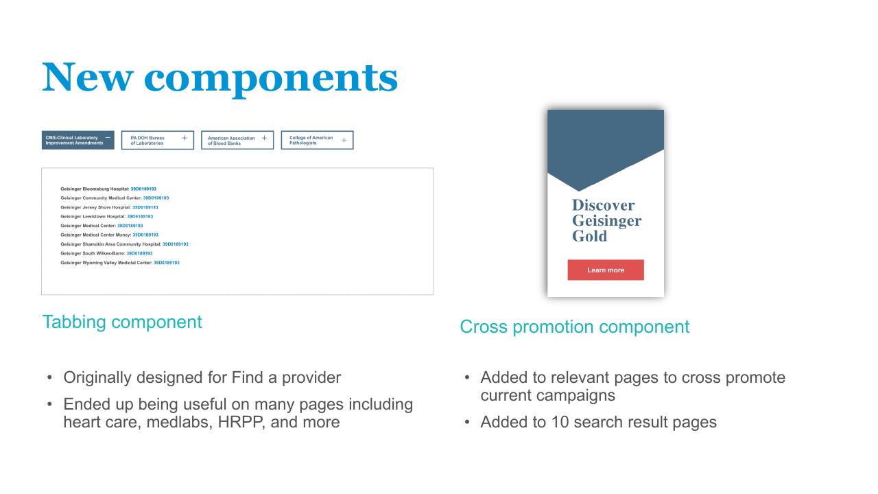
Tabbing component
Originally designed for the Find a Provider experience. Ended up reused across heart care, medical labs, the Human Research Protection Program, and more.
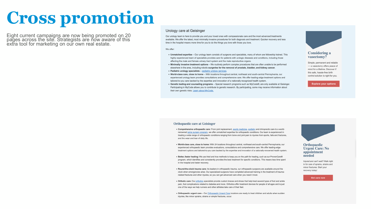
Cross-promotion component
A visual block resembling a display, with an angled "aperture" cut to catch the eye. Designed to surface internal Geisinger services and campaigns on relevant pages.
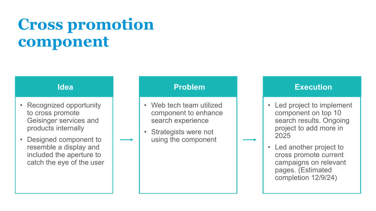
Cross-promotion: from component to campaign tool
A single component that grew into a site-wide marketing surface.
The idea
- Recognized opportunity to cross-promote Geisinger services and products on internal real estate
- Designed the component to resemble a display, with the aperture as the visual hook
The problem
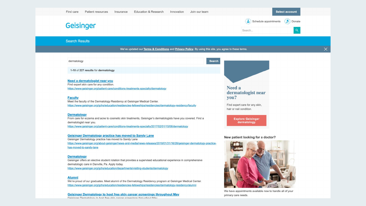
- The web tech team adopted it to enhance search-results pages
- Strategists weren't using it for active campaigns — the surface was underused
The execution
- Led rollout on the top 10 search results pages
- Led a separate project to cross-promote active campaigns on relevant service pages
- By rollout: 8 active campaigns across 20 pages
Service-line and section refreshes
The same visual and UX system was applied across more than twenty service lines, programs, and pages. Highlights below.
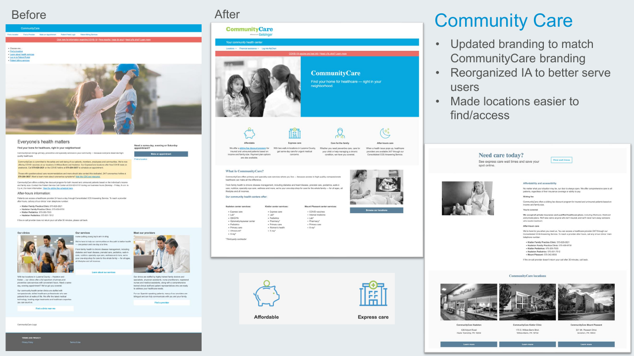
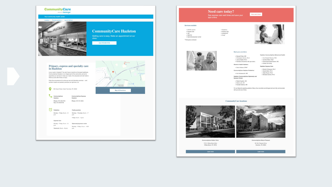
Community Care
- Updated branding to align with CommunityCare's identity
- Reorganized IA to better serve users
- Made locations easier to find and access
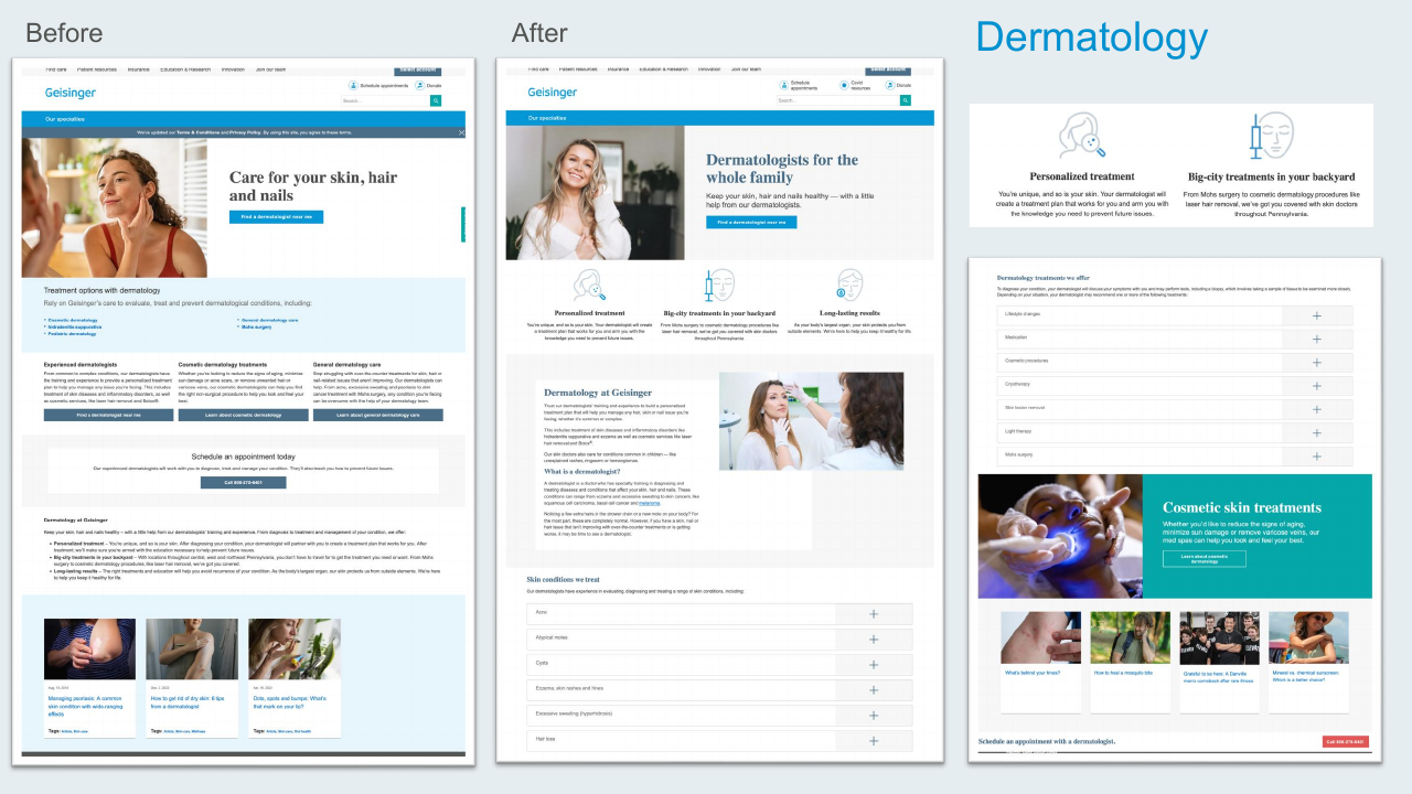
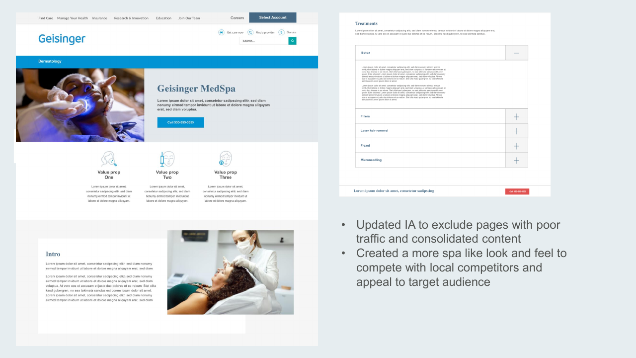
Dermatology
- Updated IA — cut low-traffic pages and consolidated content
- Created a more spa-like look and feel to compete with local competitors and appeal to the target audience
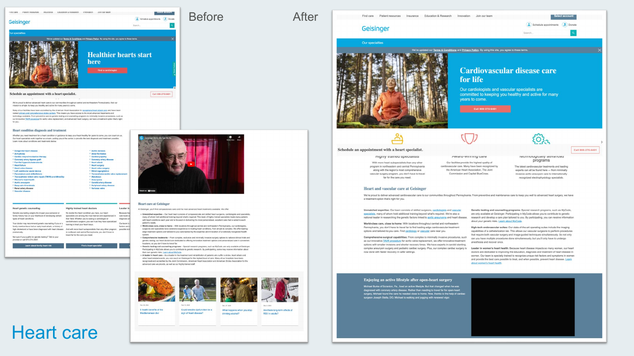
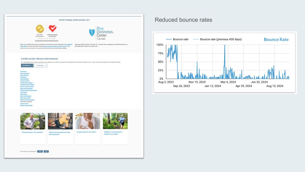
Heart Care
Redesigned the cardiovascular care landing experience. Bounce rates dropped meaningfully post-launch — the new hero, condition cards, and patient story integration shifted how users engaged with the page.
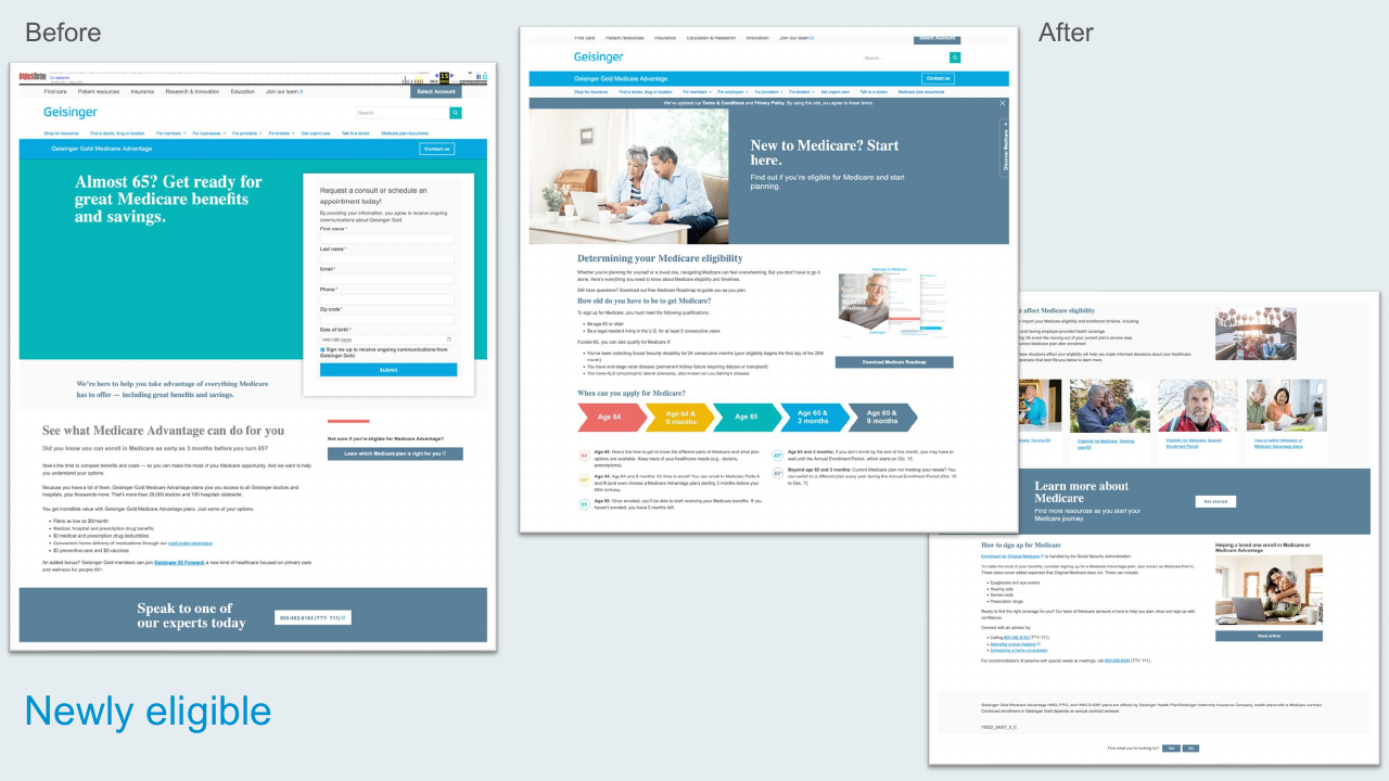
Newly Eligible (Medicare)
Replaced a form-first hero with a friendly Medicare eligibility roadmap, an age timeline, and clear next-step content for people approaching 65.
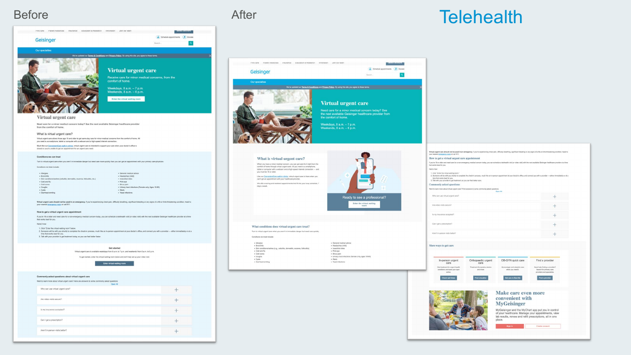
Telehealth (Virtual Urgent Care)
Brought the virtual urgent care landing page into the new system with illustrated hero artwork, clearer "what is this?" framing, and integration with related care options like in-person urgent care and find-a-provider.
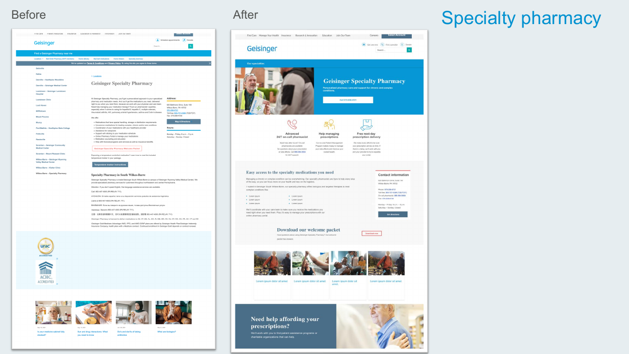
Specialty Pharmacy
Restructured a dense, text-heavy page into a hero-led experience with clear value props (24/7 on-call pharmacist, prescription management, free next-day delivery) and a concise contact panel.
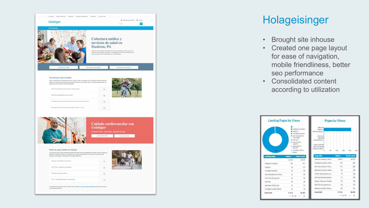
Hola Geisinger
- Brought the Spanish-language site in-house
- Created a single-page layout for ease of navigation, mobile-friendliness, and better SEO
- Consolidated content based on actual page-view data
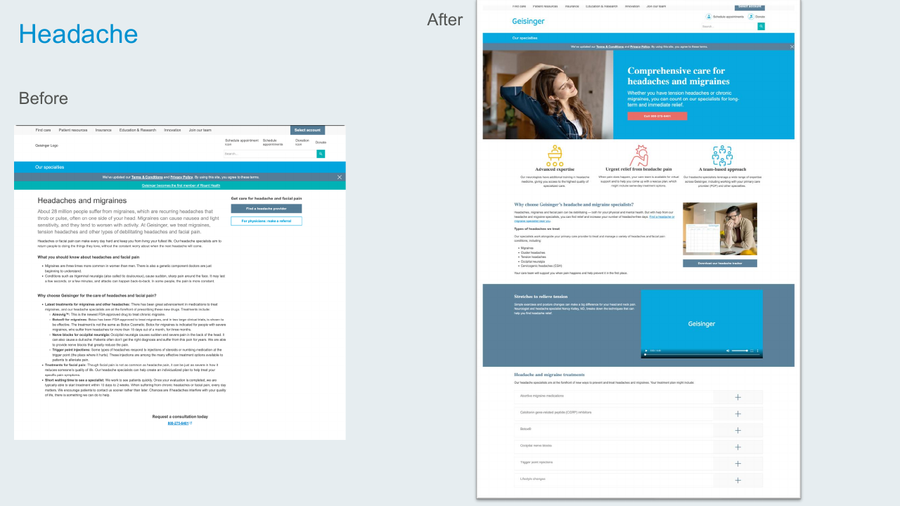
Headache & Migraine Care
Replaced the legacy text-only treatment page with a value-prop trio (advanced expertise, urgent relief, team-based approach), a stretches video, and an accordion of treatment types.
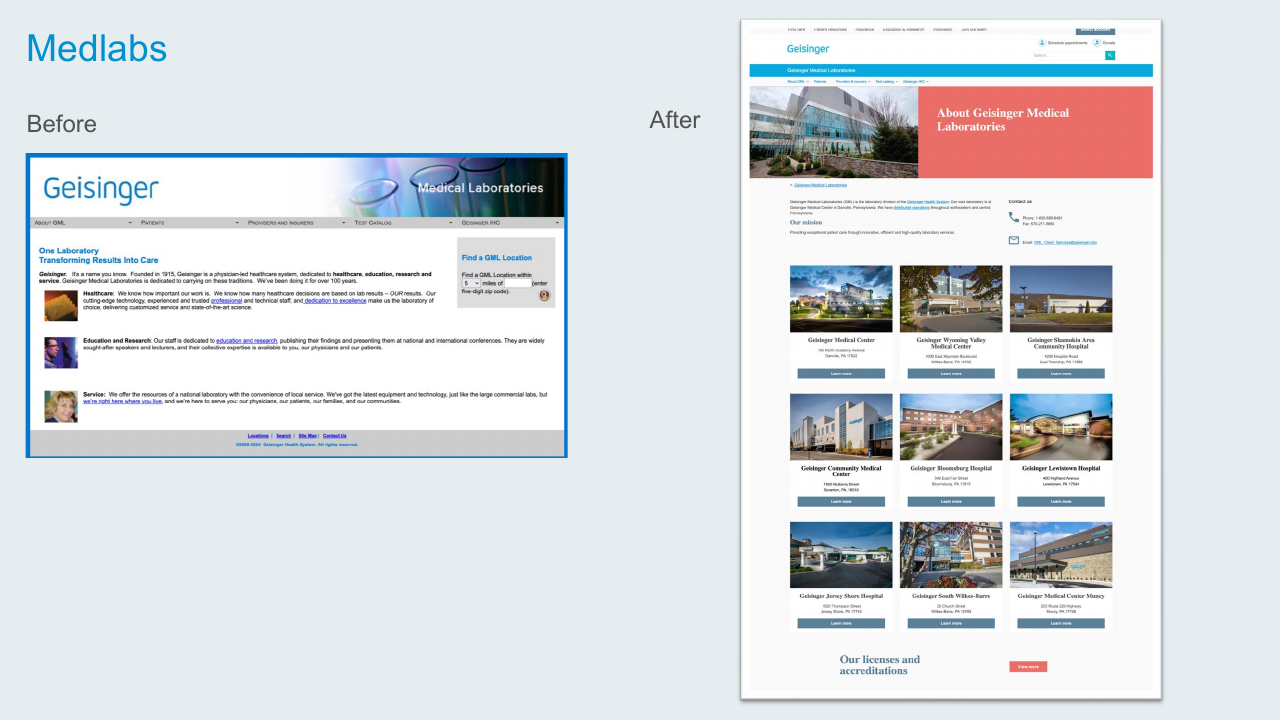
Geisinger Medical Laboratories
Replaced a dated branded page with a modern hero, location grid, and a focused "About / Mission / Contact" structure.
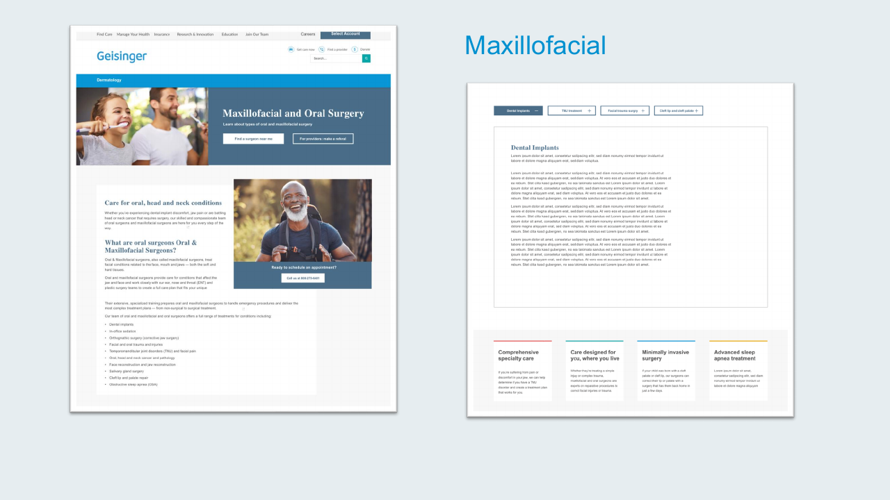
Oral & Maxillofacial Surgery
Built a new page for the oral surgery service, using the tabbing component for treatment categories and a value-prop row for the four specialty pillars.
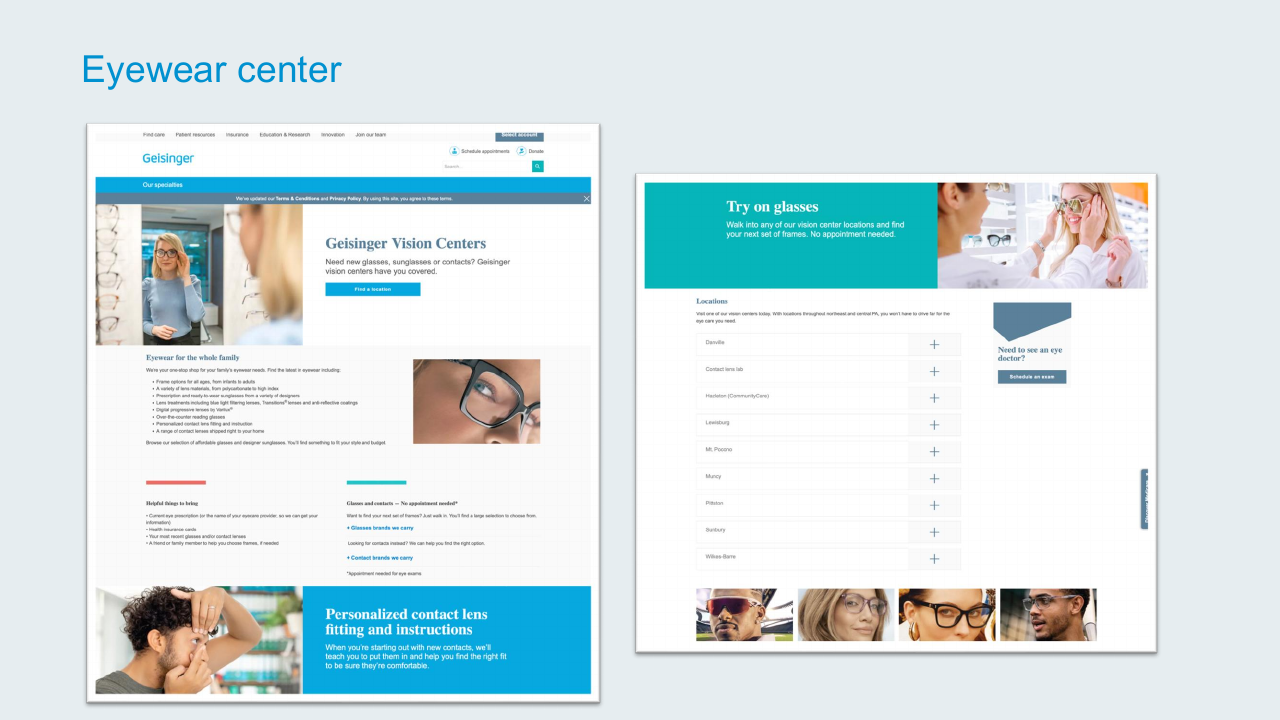
Eyewear Center
Refreshed the vision center landing with a new "Try on glasses" hero, locations accordion, and the cross-promo block to drive eye-exam scheduling.
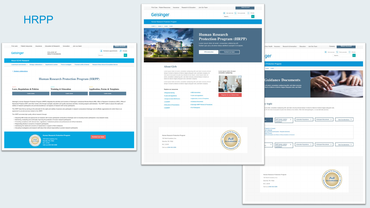
HRPP (Human Research Protection Program)
Built three connected pages for the research protection program — about, guidance documents, and research resources — using a consistent hero pattern and the tabbing component for guidance documents by topic.
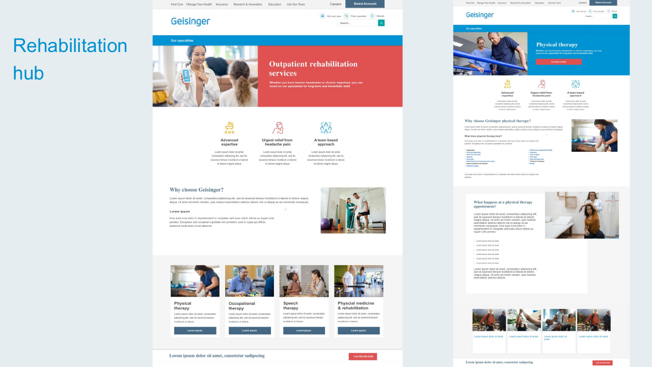
Rehabilitation Hub
Designed the landing experience for outpatient rehabilitation services — physical therapy, occupational, speech, and physical medicine — with a hub-and-spoke structure for the four service lines.
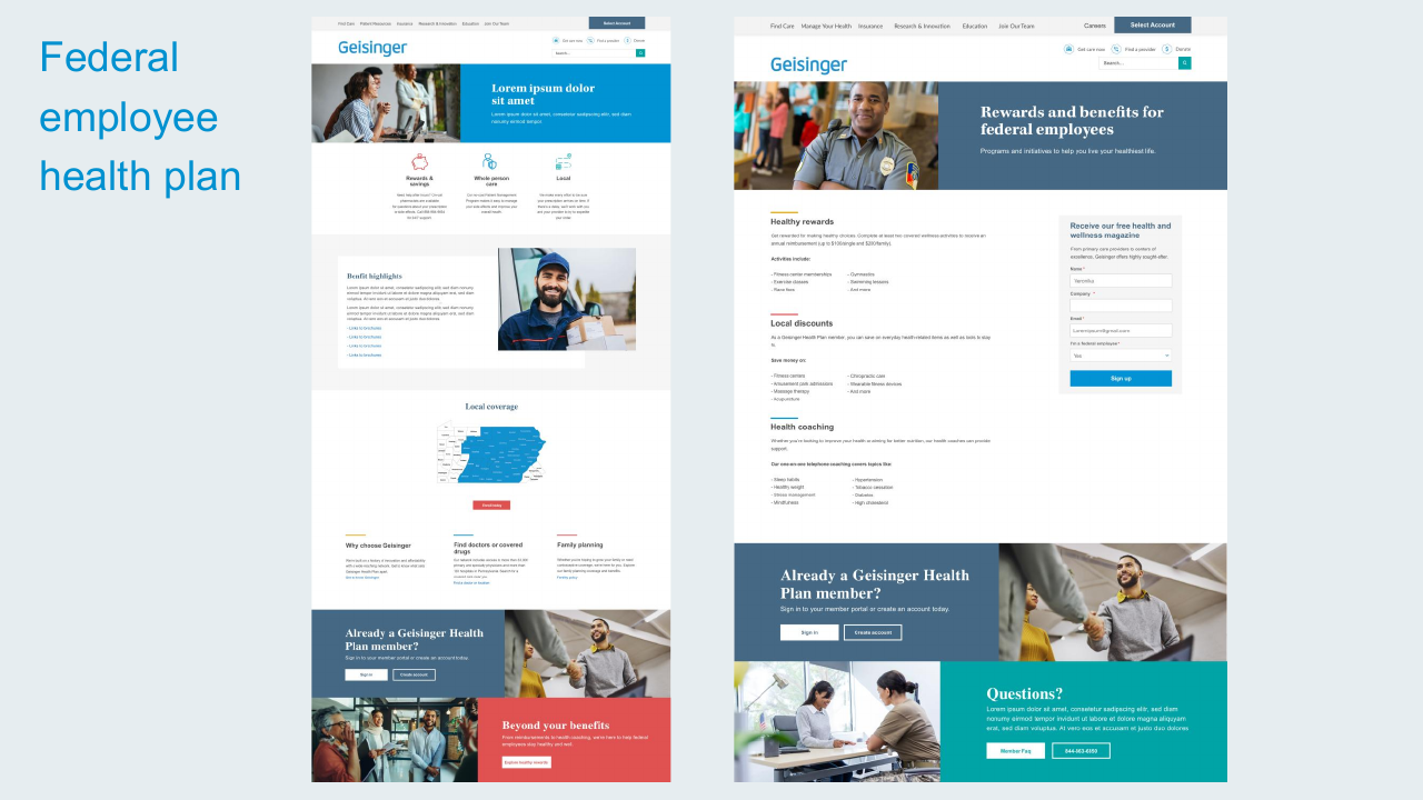
Federal Employee Health Plan
Built a benefits page for federal employees with healthy rewards, local discounts, and health coaching — a sign-up form integrated alongside the content for plan-comparison flow.
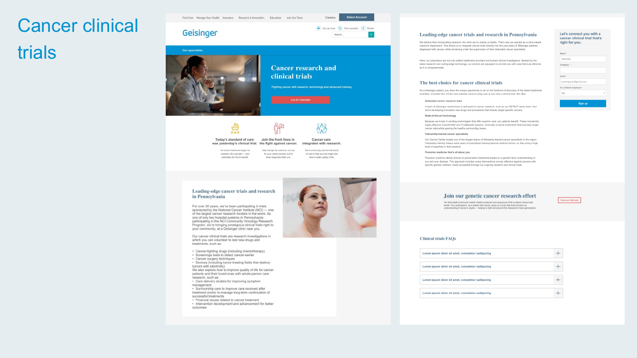
Cancer Clinical Trials
Designed the clinical trials experience with a research-and-trials hero, value-prop row, and a clear sign-up form for patients interested in participating.
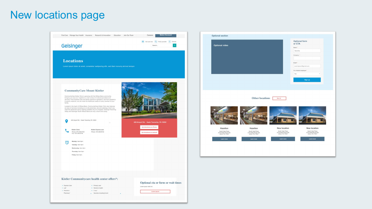
New Locations Page Template
Created a reusable locations page template — hero with location name, address and directions, hours, services list, and a related-locations grid. Now used across the site for any clinic, practice, or facility.
Reflection
The 2024 refresh wasn't a rebrand — it was a tune-up. The site had matured but its visual language and component library hadn't kept up. Working as the sole designer, I picked the highest-impact pages, built the components once, and rolled them out everywhere they fit.
The pattern that worked: design a component to solve a specific page's problem, then notice all the other pages it could solve too. The cross-promotion block, the tabbing component, the locations template, the value-prop trio — all started as one-page solutions and became system-level patterns.